Logo development and branding concept
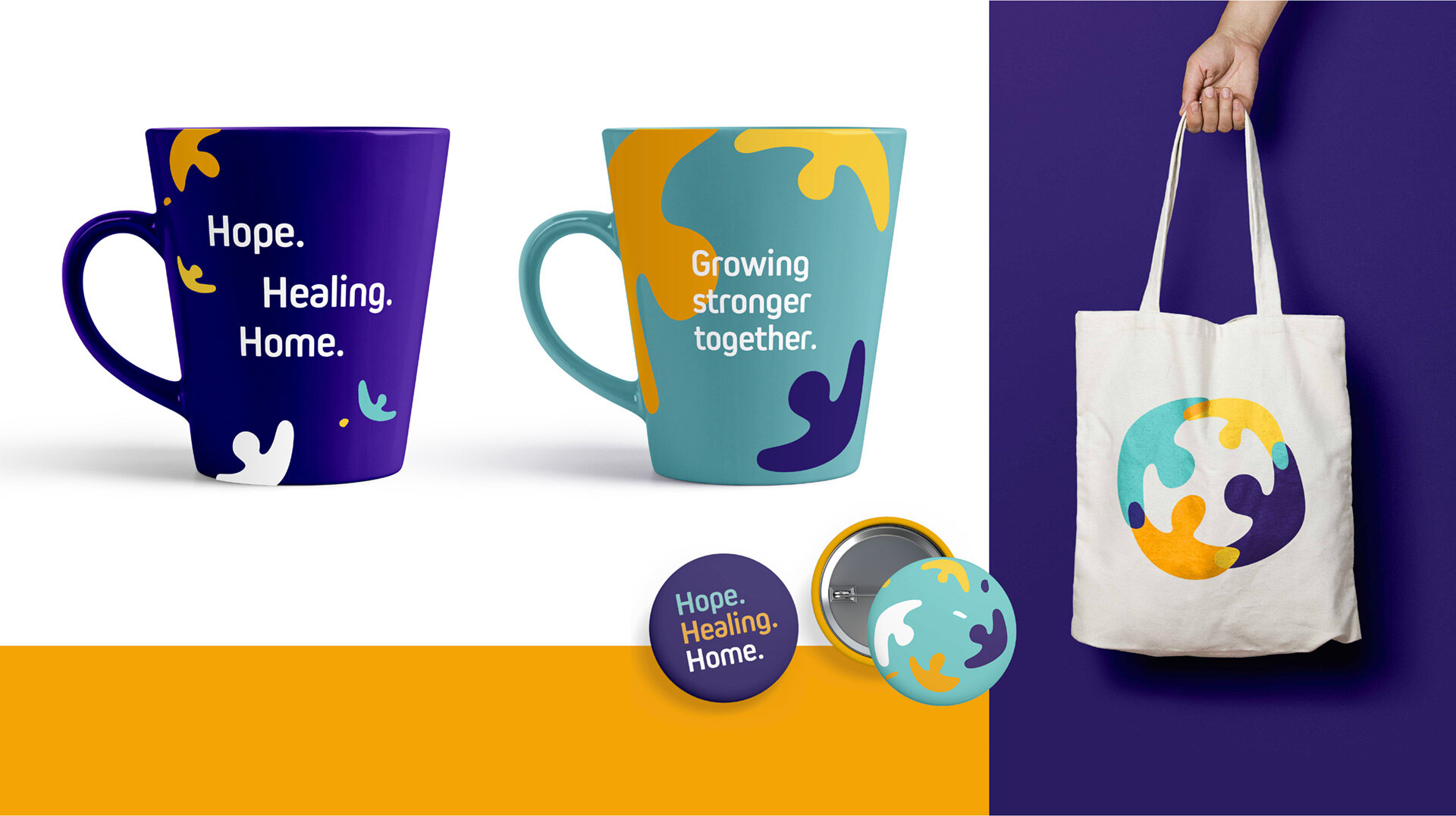
Closer to Home is a non-profit organization dedicated to keeping families together. The logo design and subsequent brand exploration are about reconnecting — coming together to form strong familial, community, and cultural connections.
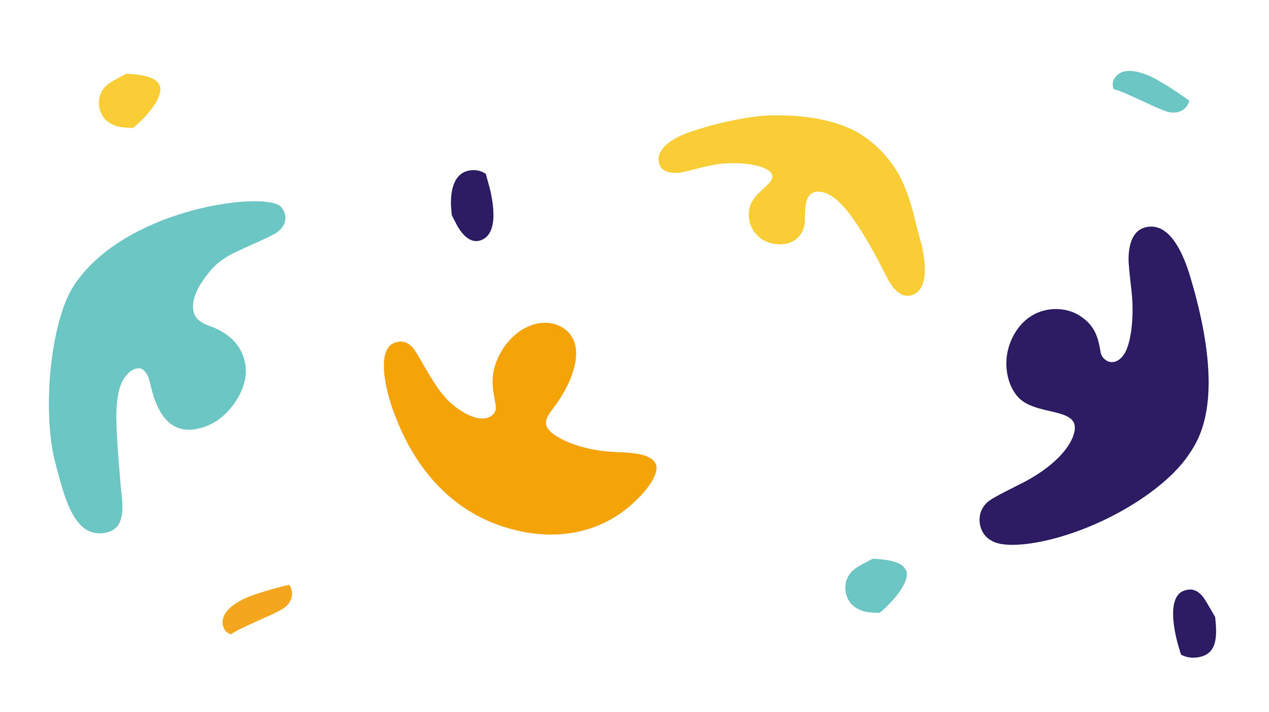
The mark is made up of four unique shapes. Each shape is an abstract representation of a person with their arms spread wide in a welcoming gesture. The overlapping areas between each shape represents connection, common ground, and the bonds between us.
Designed at Strut


